RarePark Studios / KŌMI design concept
KŌMI — A quieter kind of energy.
Identity / Packaging / Pattern / Concept study
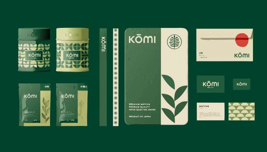
The visual direction
Botanical geometry, deep matcha green and soft cream. A cohesive family of packaging and stationery that finds its rhythm in repetition.
About this study
A RarePark studio concept study. This artwork is not presented as a commissioned client campaign or evidence of commercial results.
For your brand
Use this study as a starting point for a conversation about your own visual direction. Your product references, audience, intended use and deliverables shape a separate project brief.
Explore visual design services Back to the collection